Fall Color Palettes for a Considered Luxury Event
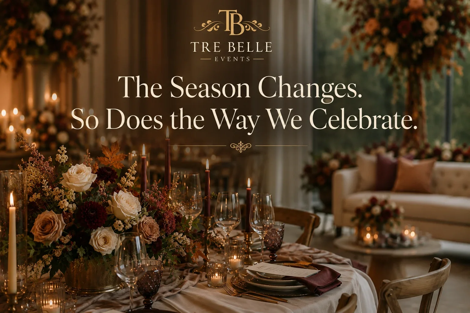
Fall in the DMV region brings a shift in light and a shift in expectation. Clients often arrive with a mood board full of orange, burgundy, and gold, assuming a fall event color palette means leaning into the most obvious version of the season. As designers, our first job is usually to slow that down and look at the room itself before committing to any palette.
Start With the Room, Not the Calendar
Every venue in Maryland, Virginia, and Washington, D.C. has its own material language already in place. Wood tones, stone, existing lighting, and window exposure all shape how color will read once the room is full. A fall event color palette that ignores the architecture ends up sitting on top of the space instead of belonging to it. We walk the venue first, noting where natural light falls in late afternoon and where the room already carries warmth or coolness, before selecting a single swatch.
Moving Past the Expected Palette
Orange and burgundy are not wrong. They are simply overused without variation. A more considered approach pulls from the same seasonal family, deep plum, ochre, moss, and bronze, but adjusts saturation and proportion so the palette feels specific to the event rather than generic to the season. We often anchor a palette with one deeper, richer tone and let two or three quieter neutrals do most of the work. This keeps the space feeling composed instead of costume-like.
How Materials Carry Color
Color in event design rarely comes from a single source. It moves through linens, florals, draping, and finishes, and each material carries color differently. Velvet reads a shade darker than its actual tone under evening light. Silk and satin reflect more, which can wash out deeper fall colors if not tested in the room beforehand. When we build a fall event color palette, we test fabric swatches under the specific lighting plan for that event, not under daylight in a showroom. This is where a lot of otherwise good palettes go wrong.
Where Proportion Comes In
The most common mistake in seasonal design is applying color evenly across every element. A cohesive palette needs proportion. If florals carry the richest tone, linens and draping should sit a step lighter so the eye has somewhere to rest. Furniture and rental pieces then act as the neutral structure that holds the room together. Scale matters too. A small dinner for forty reads differently than a two-hundred-guest reception, and the same palette needs to be adjusted for how much surface area it will actually cover.
Designing for the DMV Fall Season
Weather in this region is unpredictable through October and into November, which affects how palettes function across indoor and outdoor spaces. A tented event on the Eastern Shore or a rooftop reception in D.C. needs a palette that holds up under both natural and installed lighting, since guests often move between the two as temperatures shift throughout the evening. We plan palettes with that transition in mind from the beginning rather than treating it as an afterthought.
Working With One Design Team
A fall event color palette that spans florals, linens, draping, and furniture works best when a single team is thinking about all of it at once. When those decisions are made by separate vendors working from different references, small inconsistencies show up, a floral tone that reads warmer than the linen, a drape color that shifts under the room's lighting, a rental finish that was never tested against the rest of the palette. Coordinating those decisions from the start, rather than reconciling them after each vendor has already ordered, is one of the clearest ways to keep a fall palette from feeling disjointed once it is installed in the room. It also means adjustments can happen early, while a swatch or sample is still easy to change, instead of on-site the week of the event.
The Result of a Considered Palette
A fall event color palette, done well, does not announce the season. It simply feels appropriate for the room, the guest count, and the time of year, without leaning on cliché to get there. That is the difference between a palette that photographs well for a moment and one that actually holds up in the room, from the first guest arrival through the last dance.
Ready to plan a fall event with a palette built around your venue? Schedule a consultation with our design team.