Building a Color Palette That Feels Intentional
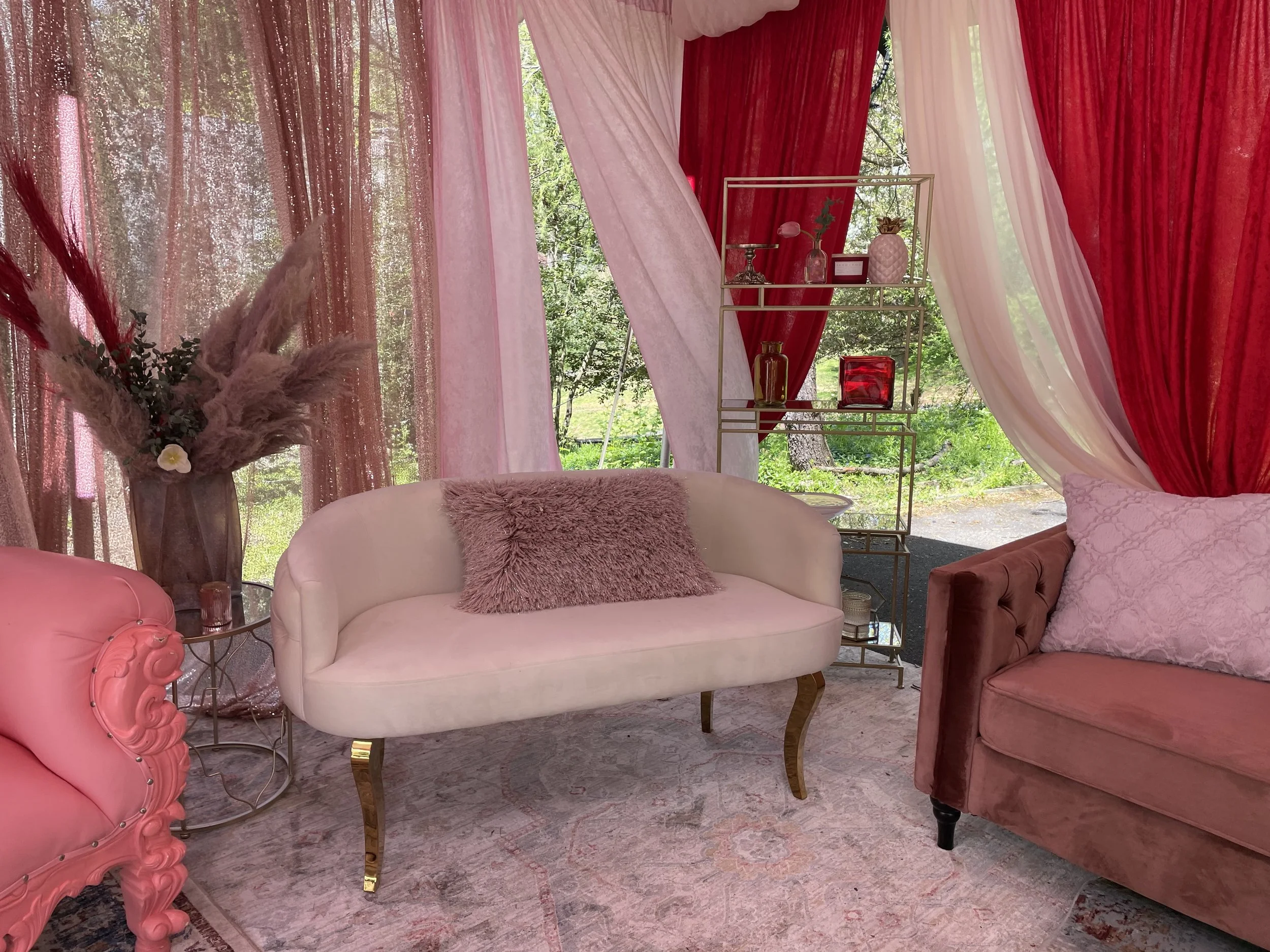
Most people think about color last. We think about it first.
An event color palette design is not a mood board exercise. It is a structural decision that shapes how a room reads the moment guests walk in, long before anyone notices the florals or the furniture. Color is one of the first things a guest's eye processes, and it sets expectations for everything that follows.
Start With the Room, Not the Linens
When we begin an event color palette design, we start with the venue's existing materials: the wood tones, the wall color, the flooring, the natural light. A ballroom with warm wood finishes responds to color differently than a glass-walled space in downtown Washington, D.C. Building a palette without accounting for what's already in the room is one of the fastest ways to end up with something that feels disconnected once it's installed.
We ask what the space is already telling us. Cool stone and steel call for a different palette than warm brick and timber. The goal is a palette that feels like it belongs to the room, not one layered on top of it.
Proportion Matters More Than Color Choice
Clients often come to us with a color in mind: sage green, dusty blue, deep burgundy. The color itself is rarely the problem. The proportion is.
A considered event color palette design typically works in layers: one dominant tone that carries the space, a secondary tone that supports it, and a smaller accent used with intention. When all three colors compete for the same amount of visual weight, the result feels busy instead of composed. When the proportion is right, the space feels calm even with multiple colors in play.
Texture Changes How Color Reads
Color does not exist on its own. A matte linen and a satin drape in the same shade will read as two different colors under the same lighting. This is where design experience matters: knowing how material and texture shift a color's temperature and depth.
We factor texture into every event color palette design because it determines whether a space feels flat or dimensional. A single tone carried across varied materials, velvet, linen, sheer fabric, often creates more depth than three separate colors placed side by side.
Lighting Is Part of the Palette
No color palette holds up under the wrong lighting. Warm uplighting shifts cool tones toward gray. Cool white lighting can wash out warm neutrals entirely. We test palette decisions under the lighting plan for the event, not under daylight or a screen.
This step is easy to skip and expensive to get wrong. A palette approved in a bright showroom can look entirely different once the room is lit for evening. Planning color and lighting together, rather than in sequence, keeps the final environment consistent with what was approved.
A Common Mistake: Matching Everything Exactly
One of the more common requests we get is to match every element, linens, florals, furniture, drape, to the exact same shade. It sounds cohesive in theory. In practice, it flattens the space.
A refined palette allows for tonal variation within the same color family. Slight shifts in shade and material create depth that an exact match cannot. Cohesion comes from a consistent logic across the palette, not from every surface matching a single swatch.
Designing for Maryland, Virginia, and D.C. Venues
The venues we work in across Maryland, Virginia, and Washington, D.C. vary widely: historic estates, modern hotel ballrooms, industrial event spaces, private residences. Each one carries its own architectural language, and the palette has to work with that language rather than against it. A color palette that works beautifully in a bright, modern space may need real adjustment for a historic property with dark wood paneling.
This is why palette decisions come early in our process, alongside the draping and rental plan, not after those decisions have already been made.
An intentional event color palette design is one of the clearest signals of a well-designed space. It's rarely the most visible decision on the day of the event, but it's one of the first things that determines whether the environment feels composed or improvised.
Schedule a consultation with our design team to start building a color palette for your space.